
Clearer, more consistent, and easier to read
ANWB
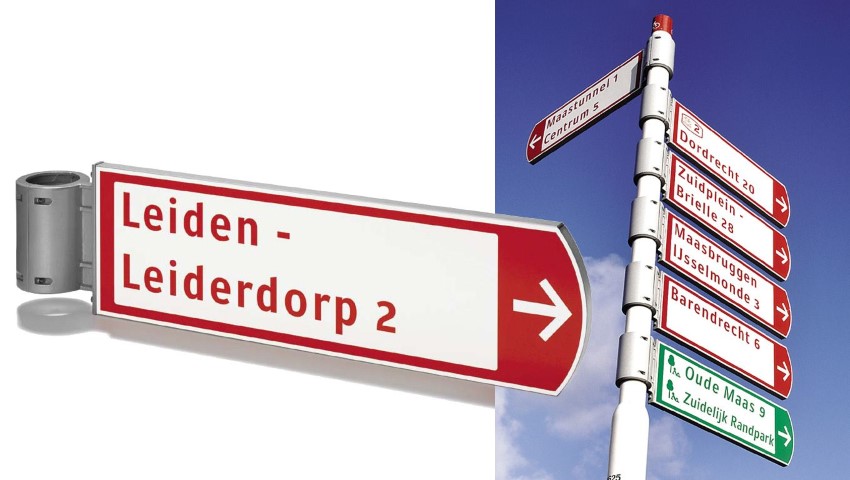
Redesign ANWB finger posting
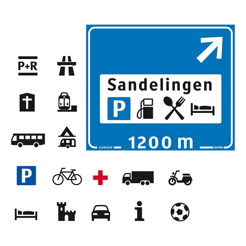
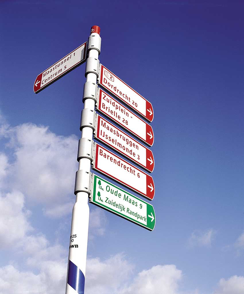
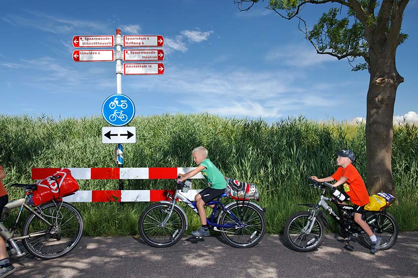
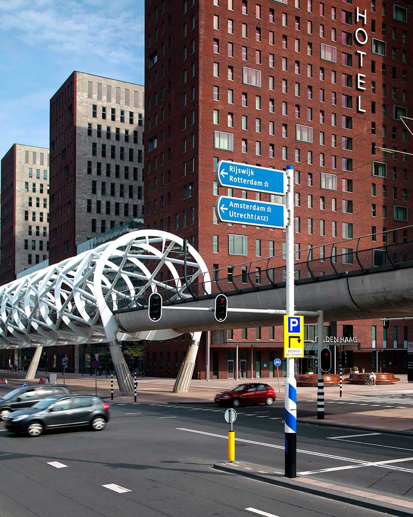
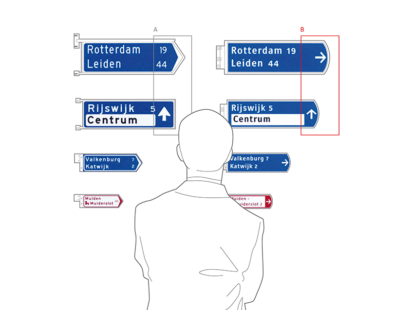
Signage is one of our particular specialisms. In the late 90s we developed a new version of the small red ANWB signpost for cyclists. The redesign takes into account industrial-, spatial-, graphic design and typography. The result has significant improvements; the signs are clearer, more consistent, and easier to read. Based on our sustainability vision, we took the existing poles as a starting point for our design, rather than destroying them. Where possible new parts are made of durable materials, like stainless steel and aluminium.
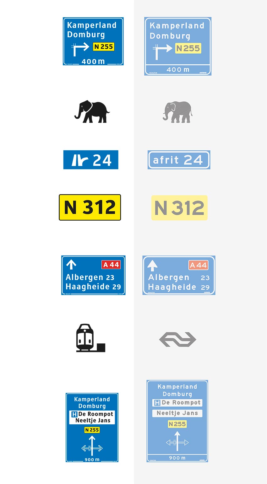
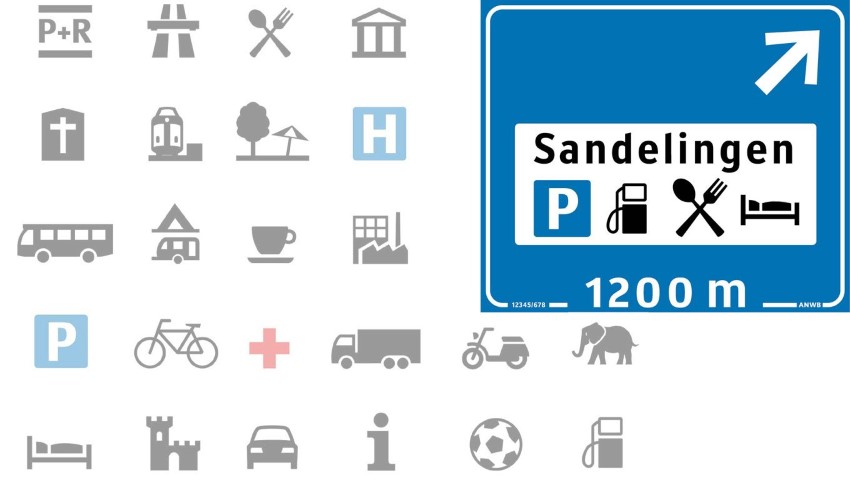
Later, we also developed other types of signage for the ANWB, including a complete set of dedicated pictograms, a new font and open arrow shapes. The most important improvement of all our work for the ANWB is the fact that all signs throughout The Netherland are consistent and easier to read.


More projects


